Saturday, 8 February 2014

Credits and Thank You Page Influence

For my credits and thank you page, Taylor Swift and Gabrielle Aplin have influenced me the most. I really loved the way Taylor included such a personal touch into her thank you's and I loved the layout of Gabrielle's, so I kind of just combined the two to create my own:


The image that I have used at the bottom of the page is an image of the artist in the recording studio and I thought this added a personal touch to the thank you's, as Taylor Swift brought her personal touch through words. 

The title inspiration came from Gabrielle Aplin because she used the same font throughout her album, which was the same font that she used for her thank you and credits pages. So, I have followed that tradition all throughout my booklet and the font that I have used for the titles on this page is the same font as I have used for my song titles and my album title, which is what Gabrielle does and that was how I was influenced. 


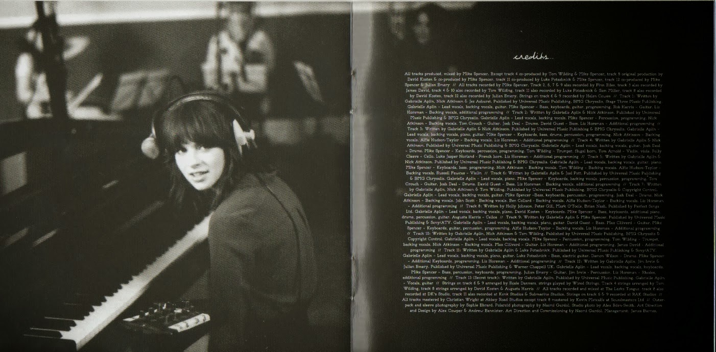
As you can see, the pictures that Gabrielle uses throughout her digipak don't actually change much in terms of the colour and the expression that she pulls in each photo, Gabrielle's Booklet, so I decided to use a similar image to what I had already used in my digipak, which is this one: 


and I then chose to use this one opposite my credits/thank you page:


There is a clear influence between my digipak and Gabrielle's, in terms of the same colour/tone images in some of the pages and also the way some of the pages are set out, where their is two-three songs to a page and also the way that she uses the nature images behind a faded black box. This is where I got all of my influences from; however I mixed them together with Taylor Swift's idea, by having lyrics going up the side of a page and by having an image acting as the background to a page or going across both pages with the lyrics on top. 

Taylor has a lot of thank you's and credits and so does Gabrielle Aplin; however I don't have many because one person, Paul Soler, played and recorded the instruments for my tracks and just one person recorded my lyrics onto the tracks that Paul had already created, so I was able to create just one page for both the credits and thank you's.


Taylor's credits are also mainly on each lyric page and the people who wrote the song are named on the same page. As you can see above, that is Taylor's thank you page and she has a lot of thank you's because her album made it so big and she therefore needed a bigger team, having more to thank; however I just had a small team and have addressed the thank you's towards that team within my thank you section. 

Before I made the thank you page, I studied the kind of thank you's that Gabrielle and Taylor were making and I also looked at their credits, allowing me to create mine. These were the notes I made before creating this page:

Friday, 7 February 2014

Influences for Credits

During my research, I also looked at the back of the artists albums to see what they have in terms of copyright material and barcodes etc. and my main influences between my chosen artists have been KT Tunstall and Gabrielle Aplin. I previously looked at their work, Back of Albums, and this research has highly influenced my work that I have just produced.

This is the back of KT's Album and she has her copyright information below her song titles and as I was highly influenced by the back of KT's album in terms of the positioning of the song titles etc, I have chosen to place my copyright information below my lyrics also.
 
 
Gabrielle also has her copyright information placed at the bottom of her album on the back cover, similar to KT's; however Gabrielle doesn't have her lyrics in the same place. I think the copyright information works best at the bottom of an album and is mainly placed at the bottom anyway so that it doesn't take up too much room on the back cover. If you look at my previous research into the back of album covers (the link is above) you will see what I mean. This is Gabrielle's copyright information:


Both of these artists have influenced my final product and this is what I have produced as a result:


I am going to move the song titles down slightly so that there isn't as big a gap between them and the copyright information. I also need to the add the barcode and then the back cover is done.

My next steps are to add my credit/thank you page into my digipak and then complete my advert.

Wednesday, 5 February 2014

Comparisons Between Text Effects and No Text Effects For Audience Feedback

Trials with Text

After trying out the white colour for my text on my front cover, I found that it didn't work; however I have has some suggestions to try adding some effects onto the black font.

In photoshop, I have add some effects to try and make both the artist name and title stand out more, rather than blending into the tree. This is what I have done:


Although the quality of the image isn't great on here, you can clearly see the difference that it has made by adding both an outer glow and drop shadow onto the text to create more definition to it. This allows the text to stand out more against the bark of the tree rather than before when it was just solid black:


The text above definitely blends into the barc more than it does now after adding two effects to the font. As you can see, the title of the album has also changed in appearance, as I have added some effects to that too to ensure that it stands out:


Onto the title of the album, 'My New Dreams', I have added the outer glow effect to create more definition to the title, allowing it to start out more clearly to the audience.

I think by adding the effects of the both the artist name and the album title, it has made a huge difference to appearance by making them more readable by the audience.

I am going to gather some audience feedback as to which they prefer, i.e. effects or no effects and this will influence my decision. I will keep you posted with their feedback.

Tuesday, 4 February 2014

Trialling Text in White

I had some feedback on my digipak and album cover recently and it was suggested that I try the text of the title of my front cover in white, rather than black. I have tried this and it really doesnt work:


I much prefer the black text to the white because there is a shine on the tree coming from the sunlight which is white and the white text just blends in with it, making it hard to read. Although the white text goes with the back cover better, I feel like the black works better in terms of standing out and also as a marketing technique as people are more likely te be drawn to a title that stands out.

Monday, 3 February 2014

Credits and Copyright Information

Tonight, I have been looking back into the research that I did to do with the credits that featured within the different artistes digipak's and also the copyright information and record label information that features on the back of the album covers.

As I mentioned in a previous blog post, Institutions, I am focusing mainly on KT Tunstall's record label as I feel that I am most similar to this artist in terms of the music that I write and the image that I portray as a singer/songwriter. I am also planning to use the copyright information that features on the back of KT's album, as this links in with the research that I did into the institutions and genre. 

I will focusing on these two aspects over the next week, before moving onto my magazine advert. 

Audience Feedback

I haven't received a great deal of feedback as yet; however I have had some:


Both of these are extremely positive and complement my work extremely well, which shows that I am meeting the needs of target audience as they're enjoying the piece that they see. Both emails complement the digipak on it's professional look, which is really nice and they also love the way it has been constructed.

The only minor issue was the syncing of the singing parts in my music video. Over the next week, I am going to focus on tightening up the editing, which was my goal anyway, so this has confirmed that I need to do this. 

Overall, the feedback in which I have received is extremely positive and I am looking forward to hearing more.