Wednesday, 26 February 2014

Audience Feedback on all 3 Products

To finish off gathering my target audience's views, I have sent out an email to allow a range of my target audience to get across their feedback on their views on all 3 products and whether they feel like they all work together. Here is the email that I have sent out:
 

As you can see above, I have included links to all three products; my music video; digipak and advert. I only sent out the email yesterday and I have already received a range of positive feedback which is fantastic.


Above, the colour and the font choices have been picked up on and how they work well with the type of music that I am promoting. This is brilliant because I have focused so much on showing my research within my products and as you can see from my previous blog posts, I have focused a lot on the text and the colour of my fonts, so it's great that someone has noticed that.


Again, the feedback above has noticed how the colours and layout all link together within my 3 products and how they also link to my research, which is great. The only issue is a typing error which I can easily change; however it is great that they have picked up on it, as it allows me to reflect on any other errors within my work. They also say how the music video links in well with the idea of having the black and white effect, which is also an area that I focused specifically on, so again it's great that the audience are picking up on it. This person also picks up on the research that I conducted and how many of the artistes who included their lyrics within their digipak also have personal, 'behind-the-scenes' footage. They have recognised that I have done this on two different pages within my digipak, Digipak Post, which shows that I have met the needs of the target audiences expectations in terms of what they would expect from a singer/songwriter artist.


The feedback which I have received above was actually on my rough video, where I hadn't edited it more tightly to ensure that no movements were out of sync with the lyrics. Now that I have edited it and I have produced a new video with different scenes (the mum on the bed), this has combatted the issue of images being out of sync. I will send out a new link to my new video. Also, they have picked up on the typing error which can be easily changed.


From the feedback above, I will reply to this and explain that I did have intentions to construct the image that I have created for the advert as a result of my research.

This was my reply to the email above:


 As you can see, I have explained that as a result of my research, this is what influenced all 3 pieces including my advert.

Monday, 17 February 2014

Final Music Video

Below is the link to my final piece. I have made some slight changes to the video with a few tweaks to the editing as a result of audience feedback to make it slicker and more professional:

Reach Out by Kathryn Dowson

Sunday, 16 February 2014

Adverts

After finding the two adverts that have influenced my project massively, I have found it hard to find any other adverts for my chosen artists which promote their CD's. Unfortunately, I am unable to find any adverts to compare with the 2 that I have found, which has left me unable to have any other inspiration; however each of the artists do have the main focus on their albums as themselves, which suggests to me that they would have their posters following the same pattern, which Gabrielle and Taylor's does. On both of their albums they have images of themselves and on their posters they have a different image for background for their poster, which the audience are drawn to straight away.

So although there aren't any other adverts that I can look at, I feel that the two that I have found reflect the genre that I have looked at, so thus act for all of the artists as I feel that if the other artists had an advert for their CD, it would be in a similar style to Gabrielle and Taylors.

Friday, 14 February 2014

Finished Pages - Digipak

All of my digipak is now also finished:


The back cover of my digipak was influence by Taylor Swifts, as she uses an image herself that doesn't appear within the digipak and she also includes a link to her website. For an extra, I have included my QR code for the audience to get a bit more out the album. Gabrielle, however just has her website link on the back cover of her album. 

I think that each and every page within my digipak really shows how my research has influenced me and by reading all of my previous blog posts, it becomes clear how.

More Magazine Adverts - Provided Influence For My Piece

Before I produced my magazine advert to promote my artistes CD, I found some more adverts that link into my research. These adverts are from Taylor Swift and Gabrielle Aplin, who have been my two main influences, aside my KT Tunstall who has influenced my record label, the back of my album and some other sections which are explained throughout my blog.

These are the adverts that I found:


The bottom advert is advertising Taylor's tour; which isn't the kind of advert that I am creating and Gabrielle's advert, the top image is advertising a gig where she is going to be launching her album. Because of this, I have created two different posters as a result. One of the posters is an album launch advert and the other is advertising the artistes CD.

The top two images have been the biggest influences and there are many similarities between them. Both of the posters use an image of the artist as part of the background, which really adds a personal touch to the poster and the audience are immediately drawn to the image, which is promoting the artist well. It has been shown that people are more drawn towards images rather than text, which is a good marketing/advertising technique. Both images however are completely different images to what feature on their albums and digipaks. 

Gabrielle uses a large title of her name which is in the same font as her name on her album; however Taylor uses a title of her album 'Speak Now' in the same font that she uses for her album title. Due to Gabrielle's poster advertising her album launch/gig, there is more information about the gig rather than information about her album; however Taylor's poster is explicitly advertising her album and thus includes information about her new tracks etc. 

In terms of the colours, Taylor has used the same colours that feature on her album, which is also another form of marketing/branding, as the audience then associate those specific colours with that artist and are more likely to recognise her when she brings out other material. Gabrielle uses a black and white style of colour, which links in with her album great, as her album cover is black and white and her digipak only has a splash of red showing.

For my adverts, I have gone for a black and white/ greeny colour which links explicitly with my album and this links in with my research as the other two artistes, Gabrielle and Taylor have used the same idea.

This is my advert for my album launch:


This is extremely similar to Gabrielle's as I wanted my research to be shown within my poster; however I have used different colours and I have just adapted the ideas that feature on Gabrielle's poster. I have used the same idea of having the artist name in bold and in the same font as it is on the album and then I have just used a normal plain font so that it is easy for the audience to read; thus advertising the album launch quicker. I have included a similar piece of information about the album as Gabrielle does; however I have made the key points more bold to make them stand out more. I have also added in the same style of information at the bottom of the poster, which includes the details about the gig and also a logo and link to the venue page. This is extremely similar to Gabrielle's.

For my actual advert which is advertising my CD, I have gone with a mixture of both Taylor Swift and Gabrielle's ideas:


I have gone with the overall layout that links to Taylor's poster, in terms of the postition of the title and the information about the album, and I have also used the soft effect that is used on Taylor's poster to allow the text to be placed at the bottom to create a kind of 'floating' effect and it looks like it's meant to be there, but it doesn't look too harsh; however the text links to Gabrielle's poster, as I have used the same font again for the artist name and then the same font that features on the album for the album name, also on the poster. I have gone with the same idea as Taylor by saying that I have added new tracks in; however I have used my own initiative and added in quotes from other magazines explaining their thoughts on the albums which you sometimes see in some magazine adverts. I have also included an image of the album and also a QR code like Taylor does, which actually works and leads to a website, which is my blog! I have also included an image of the artistes record label, which was influenced by Taylor's poster; however the record label was influenced by KT Tunstall as it is the same record label as what she uses. 

In terms of question 4 of the evaluation, new media technologies, I had some issues when I was designing my advert using photoshop. As I wanted to create a similar look to Taylor Swifts poster, I used an iris blur around the background image which made the face stand out in focus, yet the rest of the image was slightly blurred around the edges, creating a soft look, much like Taylor's. For the bottom of the poster, this is where the main problem occured. I tried to just feather the background image to create gradual transition from the image to blurred-like bubble at the bottom of it so that my text could be placed in there to make it stand out; however this didn't work. As this didn't work, I created a rectangle and I then feathered the shape to create a soft, blurred look to the shape. I then dropped it into a new layer by duplicating the rectangle layer and I then changed the opacity of the different layers, creating a smooth transition between the box at the bottom and the image, making it look how I wanted it to in the begginging - as if there wasn't a box there.
 Here are the tools that I used on photoshop:  


I have also stuck to my research throughout this advert in terms of having the naturistic cream tone in the background and then having the black writing and the transparent dark box, which adds to the black and white feature within my project. Taylor uses red throughout her 'Red' CD and advert, so I decided to use the same idea and stick to my project colours.

Overall, the research that I have done links explicitly with my final products and you can clearly see the way I have applied different ideas that I have taken from my research and added them into my final pieces.

Magazine Advert Dimentions

Before I started my magazine advert, I wanted to conduct some research into magazine dimensions, so that my advert looked realistic and would fit into a magazine fine. I came across this extremely helpful website and it helped me set my dimensions correctly: Momentum Press. This allowed me to the produce my magazine advert.

My Advert

KT Tunstall Music Reviews

I was recently conducting some research into magazine adverts and unfortunately, I didn't come across any more KT; however I did find some reviews of her music which were interesting:

Review 1

Review 2

Review 3

Review 4

Although they don't specifically fit into my research, these are interesting reads and gave me a better insight into how audience's view an artistes music. 

Monday, 10 February 2014

Finished Front and Back Cover

After receiving my audience feedback on my text comparisons, I have produced my final version of my album cover, front and back. I have also added to the back of my album cover since I showed it in my previous blog post, Influences, as I have added more to it. In my influences blog post you can see that Gabrielle has her record companies logo on the back of her album and I have taken both ideas from Gabrielle and KT about copyright information on the back of their albums. This is what I have produced and this is my final album cover:


I have also included a website for Relentless Records too, for my target audience to then find out information about the artist. 

More Audience Feedback on Rough Cut


Aside from the other feedback that I have already posted for my most recent rough cut, I have also received the above piece of feedback. I am pleased to hear that the narrative sections that I added into the video have worked well and have met the expectations of my audience, which I predicted that they would; however it is nice to hear it from my target audience. 

This shows that I my research has influenced my final piece well and that I have met the needs of my target which I intended to do from the outset. 

Feedback on Text Comparisons

After I sent out the email below, I received a large number of comments very quickly, which was fantastic. A lot of the comments have offered a range of improvements to make and also what they like about the album cover, which is great as there is a mixture of positive and negative criticism mixed together:


This is the different feedback that I have received as a result of sending this email:


This comment above was made by a music professional and his suggestions/feedback is for if I was going to produce this album for sales, which is great; however cannot be applied to this project. Although I can't apply it to this project, this feedback is fantastic for me to take on board and apply to my personal music/albums. I understand that the text on the album cover is hard to see, so I will have a bit more of an experiment with it and see what I can do. 


This comment above is from a lecturer at Teesside University where I am wanting to go to study media, so it is a real honour to receive feedback from Mick. He has offered some very high level feedback and for the feedback to use dodge and burn just wouldn't be possible for the software that I am using. Also, I need to be able to show comparisons between my research and my piece. The comments below, however explain his feedback and overall he thinks that what I have done is "fantastic".


The feedback that I have received has suggested that I should go for the effects that I have added on to the text to make it stand out more, so this is what I will do. I will also try and experiment with some of the suggestions that I have received and see what happens when I do. I will post my experimentation on here when I have done it. 

Saturday, 8 February 2014

Credits and Thank You Page Influence

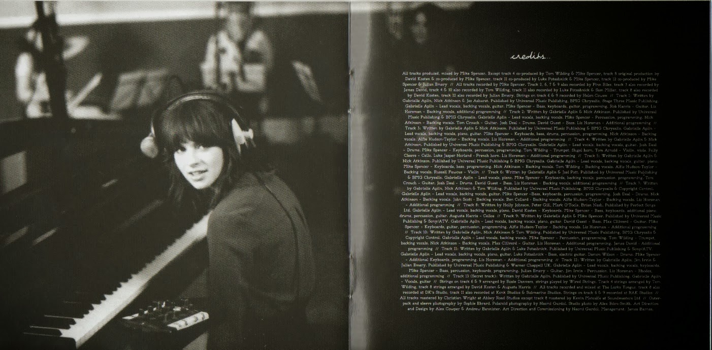
For my credits and thank you page, Taylor Swift and Gabrielle Aplin have influenced me the most. I really loved the way Taylor included such a personal touch into her thank you's and I loved the layout of Gabrielle's, so I kind of just combined the two to create my own:


The image that I have used at the bottom of the page is an image of the artist in the recording studio and I thought this added a personal touch to the thank you's, as Taylor Swift brought her personal touch through words. 

The title inspiration came from Gabrielle Aplin because she used the same font throughout her album, which was the same font that she used for her thank you and credits pages. So, I have followed that tradition all throughout my booklet and the font that I have used for the titles on this page is the same font as I have used for my song titles and my album title, which is what Gabrielle does and that was how I was influenced. 


As you can see, the pictures that Gabrielle uses throughout her digipak don't actually change much in terms of the colour and the expression that she pulls in each photo, Gabrielle's Booklet, so I decided to use a similar image to what I had already used in my digipak, which is this one: 


and I then chose to use this one opposite my credits/thank you page:


There is a clear influence between my digipak and Gabrielle's, in terms of the same colour/tone images in some of the pages and also the way some of the pages are set out, where their is two-three songs to a page and also the way that she uses the nature images behind a faded black box. This is where I got all of my influences from; however I mixed them together with Taylor Swift's idea, by having lyrics going up the side of a page and by having an image acting as the background to a page or going across both pages with the lyrics on top. 

Taylor has a lot of thank you's and credits and so does Gabrielle Aplin; however I don't have many because one person, Paul Soler, played and recorded the instruments for my tracks and just one person recorded my lyrics onto the tracks that Paul had already created, so I was able to create just one page for both the credits and thank you's.


Taylor's credits are also mainly on each lyric page and the people who wrote the song are named on the same page. As you can see above, that is Taylor's thank you page and she has a lot of thank you's because her album made it so big and she therefore needed a bigger team, having more to thank; however I just had a small team and have addressed the thank you's towards that team within my thank you section. 

Before I made the thank you page, I studied the kind of thank you's that Gabrielle and Taylor were making and I also looked at their credits, allowing me to create mine. These were the notes I made before creating this page:

Friday, 7 February 2014

Influences for Credits

During my research, I also looked at the back of the artists albums to see what they have in terms of copyright material and barcodes etc. and my main influences between my chosen artists have been KT Tunstall and Gabrielle Aplin. I previously looked at their work, Back of Albums, and this research has highly influenced my work that I have just produced.

This is the back of KT's Album and she has her copyright information below her song titles and as I was highly influenced by the back of KT's album in terms of the positioning of the song titles etc, I have chosen to place my copyright information below my lyrics also.
 
 
Gabrielle also has her copyright information placed at the bottom of her album on the back cover, similar to KT's; however Gabrielle doesn't have her lyrics in the same place. I think the copyright information works best at the bottom of an album and is mainly placed at the bottom anyway so that it doesn't take up too much room on the back cover. If you look at my previous research into the back of album covers (the link is above) you will see what I mean. This is Gabrielle's copyright information:


Both of these artists have influenced my final product and this is what I have produced as a result:


I am going to move the song titles down slightly so that there isn't as big a gap between them and the copyright information. I also need to the add the barcode and then the back cover is done.

My next steps are to add my credit/thank you page into my digipak and then complete my advert.

Wednesday, 5 February 2014

Comparisons Between Text Effects and No Text Effects For Audience Feedback

Trials with Text

After trying out the white colour for my text on my front cover, I found that it didn't work; however I have has some suggestions to try adding some effects onto the black font.

In photoshop, I have add some effects to try and make both the artist name and title stand out more, rather than blending into the tree. This is what I have done:


Although the quality of the image isn't great on here, you can clearly see the difference that it has made by adding both an outer glow and drop shadow onto the text to create more definition to it. This allows the text to stand out more against the bark of the tree rather than before when it was just solid black:


The text above definitely blends into the barc more than it does now after adding two effects to the font. As you can see, the title of the album has also changed in appearance, as I have added some effects to that too to ensure that it stands out:


Onto the title of the album, 'My New Dreams', I have added the outer glow effect to create more definition to the title, allowing it to start out more clearly to the audience.

I think by adding the effects of the both the artist name and the album title, it has made a huge difference to appearance by making them more readable by the audience.

I am going to gather some audience feedback as to which they prefer, i.e. effects or no effects and this will influence my decision. I will keep you posted with their feedback.

Tuesday, 4 February 2014

Trialling Text in White

I had some feedback on my digipak and album cover recently and it was suggested that I try the text of the title of my front cover in white, rather than black. I have tried this and it really doesnt work:


I much prefer the black text to the white because there is a shine on the tree coming from the sunlight which is white and the white text just blends in with it, making it hard to read. Although the white text goes with the back cover better, I feel like the black works better in terms of standing out and also as a marketing technique as people are more likely te be drawn to a title that stands out.